


Interactive onboarding for the Same Game Parlay betting feature
Timeline:
1 month
Role:
Product Designer
Team:
Product Owner, UX Research

5X increase to product understanding
Summary
Opportunity
If we can increase activation rate for Same Game Parlays for new customers, it will have a meaningful impact on our revenue.
Insight
We were provided with data from the product team that showed Same Game Parlays (SGPs) was the most profitable product available to customers through FanDuel Sportsbook. At the same time, the data also showed that SGPs had one of the lowest adoption rates for new sports betting customers.
Goal
Create and test experiences for new FanDuel customers to learn and adopt the Same Game Parlay feature.
Deliverables
- A variety of iterations to test
- High fidelity mock ups
- Prototype
- User testing
Discovery
I worked with UX Research to speak with customers and identify what they didn’t understand about Same Game Parlays (SGPs)
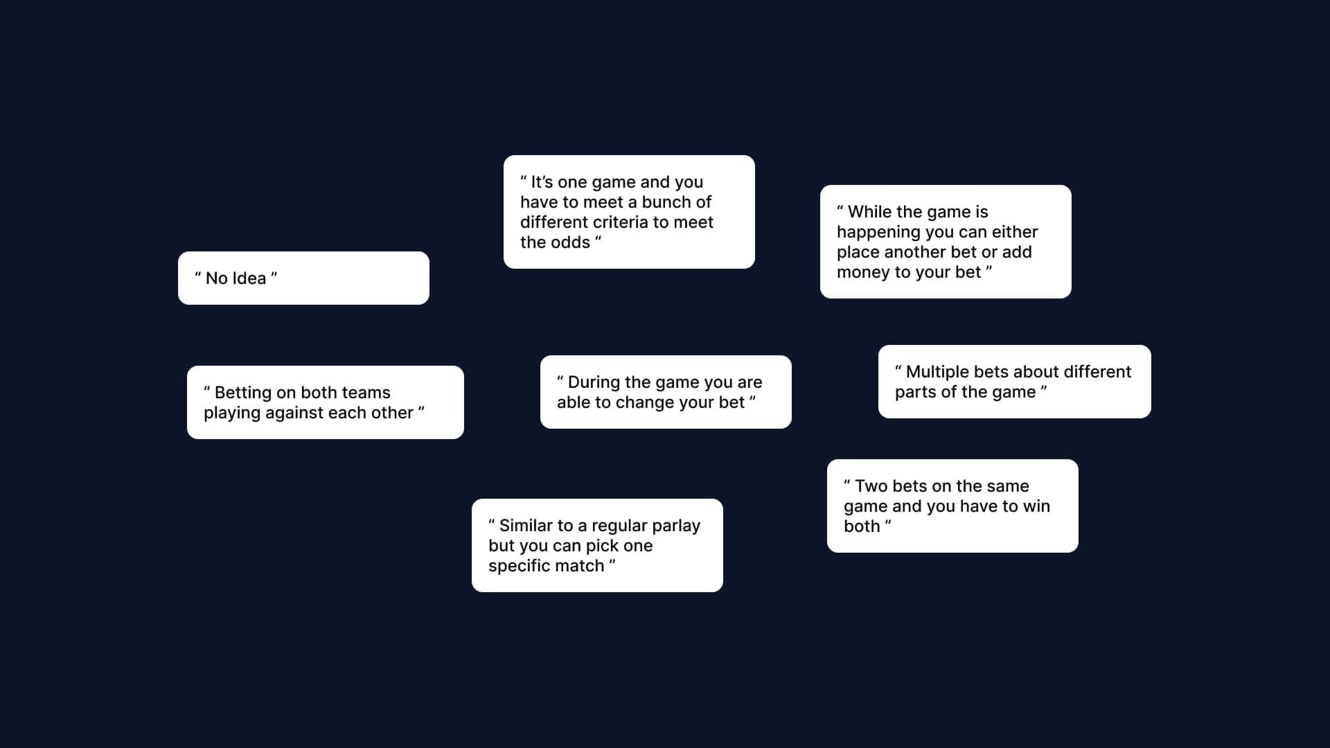
As part of our testing, we spoke with 8 customers and asked them to simply define what they thought Same Game Parlays were. The user definitions were mostly incorrect and in some cases not even close.
Customers graded their understanding of the correct definition of SGPs
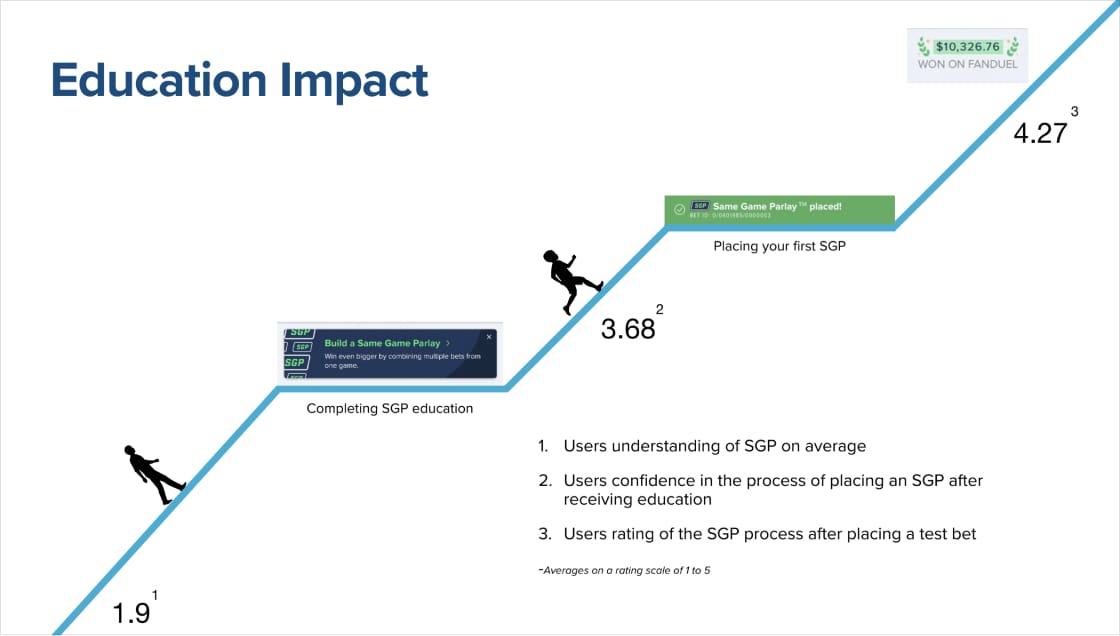
As well as asking customers to add their own definition to same game parlays, we also presented the correct definition and asked them to rate their understanding between 1 and 5. The average score was 1.9.
The same group of customers also went on to say that they didn’t feel comfortable throwing away money on something they didn’t
understand. Other reasons included the feeling that there was greater risk, they were more comfortable with other bet types, and the time associated with making an SGP bet.
Solutions & Testing
How do customers like to learn?
The UX research team knew from other studies and from direct feedback that visuals engage them, concise information is important (no long blocks of text). They also like learning by doing.
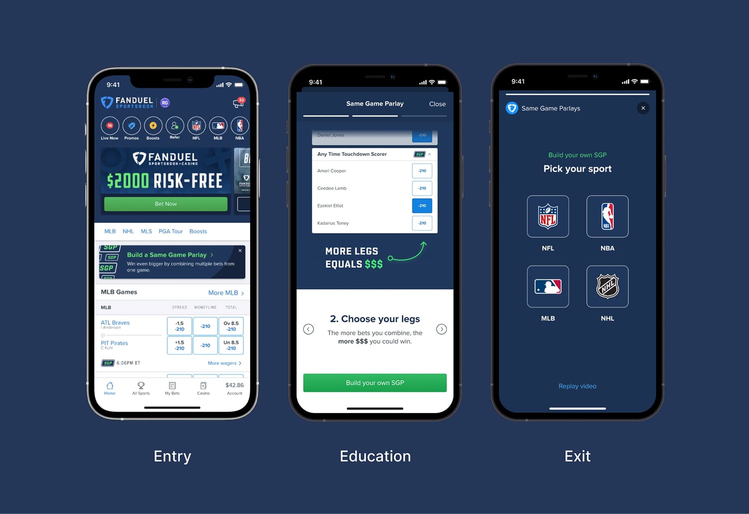
To ensure we had a consistent experience between the education types, we created an entry and exit point
The entry point was a new type of promo card embedded in the betting list. We positioned the promo card here to maximise eye balls on the education for this bet type. We would have some logic around this card so that it wouldn't be shown for customers who have already placed a bet of this type.
We created an exit point which took customers to the position where they could easily place an SGP bet with the sport type that they enjoy most. The sports offered to customers to choose from would vary based on the time of year to account for sport seasons starting and ending.
Entry point insights
- A good portion of users did not notice the banner or recognize it as a place to learn more
- Some users said they thought it was an advertisement. Others were unsure if that’s where they should be going
- 3/6 new users located the information easily
- 8/13 existing users located the information easily
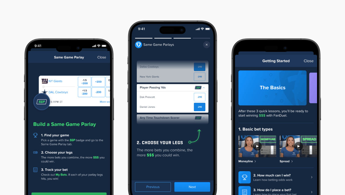
3 different education types were designed with a view to user test
We created 3 different prototypes to test our theories around what was the best way of delivering education to customers. This was based off of education types that we had explored by trying direct and indirect apps in the market.
- Single education screen
We wanted to see whether a single screen with a simple description of the feature might be enough for customers to understand the SGP bet type. This followed the same pattern that we used for other features in the app. We knew it would be quick and simple to implement with minimal engineering time.
Option 1 learnings
- Users liked that the information was broken down into three easy steps, with key information in green.
- Most users felt they would need moreinformation, which could include an example
- After placing the SGP users felt very confident, but felt that info could have been provided up front
- Stepped education
The UX research team knew from other studies and from direct feedback that visuals engage them, concise information is important (no long blocks of text). They also like learning by doing.
Option 2 learnings
- Participants mentioned that they liked the way the info was presented, but that they would like to try it themselves.
- They would like for the visuals to loop so that they can read and watch at their own pace.
- Users loved the simplicity of the presentation.
- Video education
The UX research team knew from other studies and from direct feedback that visuals engage them, concise information is important (no long blocks of text). They also like learning by doing.
Results
We increased same game parley understanding for customers
We sent out 11 unmoderated tests to customers to test the education prototypes. The stepped and video variants had the most positive feedback and with the entire experience, end to end, had an SGP understanding score of 4.27. That's over 3 rating points more than when we started prototyping new ways of explaining the bet type.
What's missing?
- Across all variants, participants asked for a description of what SGP is at the beginning.
- The ability to have animations loop and control the pace of the video.
- Users would like to see the learn more be accessible and include any terms used in the education (the basics).
- Everyone seemed to value the ability to try placing an SGP without risking their own money. Having this option, whether it be a promo where they can actually win, or simply a test where there’s no stakes would be worthwhile.
Next steps
We concluded the project with some appropriate next steps
- Implement either the video or stepped variant after edits are made.
- Making the education more easily recognizable
- If feasible adding the definition of SGP.
- Users ability to control the video pace, looping animations.
- Implement either a test SGP for users or a promotion directed at a risk free first time SGP user.
- A braze test was discussed previously, however given the information we gathered from these sessions, we believe that is not needed.
- Focused education effort across the business.
Get in contact


My inbox is always open to people looking to collaborate on interesting projects. Send a message to
stuartwalker559@gmail.com


Stuart Walker

Resume

Contact

Interactive onboarding for the Same Game Parlay betting feature
Timeline:
1 month
Role:
Product Designer
Team:
Product Owner, UX Research
5X increase to product understanding
Summary
Opportunity
If we can increase activation rate for Same Game Parlays for new customers, it will have a meaningful impact on our revenue.
Insight
We were provided with data from the product team that showed Same Game Parlays (SGPs) was the most profitable product available to customers through FanDuel Sportsbook. At the same time, the data also showed that SGPs had one of the lowest adoption rates for new sports betting customers.
Goal
Create and test experiences for new FanDuel customers to learn and adopt the Same Game Parlay feature.
Deliverables
- A variety of iterations to test
- High fidelity mock ups
- Prototype
- User testing
Discovery
I worked with UX Research to speak with customers and identify what they didn’t understand about Same Game Parlays (SGPs)
As part of our testing, we spoke with 8 customers and asked them to simply define what they thought Same Game Parlays were. The user definitions were mostly incorrect and in some cases not even close.
Customers graded their understanding of the correct definition of SGPs
As well as asking customers to add their own definition to same game parlays, we also presented the correct definition and asked them to rate their understanding between 1 and 5. The average score was 1.9.
The same group of customers also went on to say that they didn’t feel comfortable throwing away money on something they didn’t
understand. Other reasons included the feeling that there was greater risk, they were more comfortable with other bet types, and the time associated with making an SGP bet.
Solutions & Testing
How do customers like to learn?
The UX research team knew from other studies and from direct feedback that visuals engage them, concise information is important (no long blocks of text). They also like learning by doing.
To ensure we had a consistent experience between the education types, we created an entry and exit point
The entry point was a new type of promo card embedded in the betting list. We positioned the promo card here to maximise eye balls on the education for this bet type. We would have some logic around this card so that it wouldn't be shown for customers who have already placed a bet of this type.
We created an exit point which took customers to the position where they could easily place an SGP bet with the sport type that they enjoy most. The sports offered to customers to choose from would vary based on the time of year to account for sport seasons starting and ending.
Entry point insights
- A good portion of users did not notice the banner or recognize it as a place to learn more
- Some users said they thought it was an advertisement. Others were unsure if that’s where they should be going
- 3/6 new users located the information easily
- 8/13 existing users located the information easily
3 different education types were designed with a view to user test
We created 3 different prototypes to test our theories around what was the best way of delivering education to customers. This was based off of education types that we had explored by trying direct and indirect apps in the market.
- Single education screen
We wanted to see whether a single screen with a simple description of the feature might be enough for customers to understand the SGP bet type. This followed the same pattern that we used for other features in the app. We knew it would be quick and simple to implement with minimal engineering time.
Option 1 learnings
- Users liked that the information was broken down into three easy steps, with key information in green.
- Most users felt they would need moreinformation, which could include an example
- After placing the SGP users felt very confident, but felt that info could have been provided up front
- Stepped education
The UX research team knew from other studies and from direct feedback that visuals engage them, concise information is important (no long blocks of text). They also like learning by doing.
Option 2 learnings
- Participants mentioned that they liked the way the info was presented, but that they would like to try it themselves.
- They would like for the visuals to loop so that they can read and watch at their own pace.
- Users loved the simplicity of the presentation.
- Video education
The UX research team knew from other studies and from direct feedback that visuals engage them, concise information is important (no long blocks of text). They also like learning by doing.
Results
We increased same game parley understanding for customers
We sent out 11 unmoderated tests to customers to test the education prototypes. The stepped and video variants had the most positive feedback and with the entire experience, end to end, had an SGP understanding score of 4.27. That's over 3 rating points more than when we started prototyping new ways of explaining the bet type.
What's missing?
- Across all variants, participants asked for a description of what SGP is at the beginning.
- The ability to have animations loop and control the pace of the video.
- Users would like to see the learn more be accessible and include any terms used in the education (the basics).
- Everyone seemed to value the ability to try placing an SGP without risking their own money. Having this option, whether it be a promo where they can actually win, or simply a test where there’s no stakes would be worthwhile.
Next steps
We concluded the project with some appropriate next steps
- Implement either the video or stepped variant after edits are made.
- Making the education more easily recognizable
- If feasible adding the definition of SGP.
- Users ability to control the video pace, looping animations.
- Implement either a test SGP for users or a promotion directed at a risk free first time SGP user.
- A braze test was discussed previously, however given the information we gathered from these sessions, we believe that is not needed.
- Focused education effort across the business.
Get in contact
My inbox is always open to people looking to collaborate on interesting projects. Send a message to stuartwalker559@gmail.com
Stuart Walker
Resume
Contact

Interactive onboarding for the Same Game Parlay betting feature
Timeline:
1 month
Role:
Product Designer
Team:
Product Owner, UX Research
5X increase to product understanding
Summary
Opportunity
If we can increase activation rate for Same Game Parlays for new customers, it will have a meaningful impact on our revenue.
Insight
We were provided with data from the product team that showed Same Game Parlays (SGPs) was the most profitable product available to customers through FanDuel Sportsbook. At the same time, the data also showed that SGPs had one of the lowest adoption rates for new sports betting customers.
Goal
Create and test experiences for new FanDuel customers to learn and adopt the Same Game Parlay feature.
Deliverables
- A variety of iterations to test
- High fidelity mock ups
- Prototype
- User testing
Discovery
I worked with UX Research to speak with customers and identify what they didn’t understand about Same Game Parlays (SGPs)
As part of our testing, we spoke with 8 customers and asked them to simply define what they thought Same Game Parlays were. The user definitions were mostly incorrect and in some cases not even close.
Customers graded their understanding of the correct definition of SGPs
As well as asking customers to add their own definition to same game parlays, we also presented the correct definition and asked them to rate their understanding between 1 and 5. The average score was 1.9.
The same group of customers also went on to say that they didn’t feel comfortable throwing away money on something they didn’t
understand. Other reasons included the feeling that there was greater risk, they were more comfortable with other bet types, and the time associated with making an SGP bet.
Solutions & Testing
How do customers like to learn?
The UX research team knew from other studies and from direct feedback that visuals engage them, concise information is important (no long blocks of text). They also like learning by doing.
To ensure we had a consistent experience between the education types, we created an entry and exit point
The entry point was a new type of promo card embedded in the betting list. We positioned the promo card here to maximise eye balls on the education for this bet type. We would have some logic around this card so that it wouldn't be shown for customers who have already placed a bet of this type.
We created an exit point which took customers to the position where they could easily place an SGP bet with the sport type that they enjoy most. The sports offered to customers to choose from would vary based on the time of year to account for sport seasons starting and ending.
Entry point insights
- A good portion of users did not notice the banner or recognize it as a place to learn more
- Some users said they thought it was an advertisement. Others were unsure if that’s where they should be going
- 3/6 new users located the information easily
- 8/13 existing users located the information easily
3 different education types were designed with a view to user test
We created 3 different prototypes to test our theories around what was the best way of delivering education to customers. This was based off of education types that we had explored by trying direct and indirect apps in the market.
- Single education screen
We wanted to see whether a single screen with a simple description of the feature might be enough for customers to understand the SGP bet type. This followed the same pattern that we used for other features in the app. We knew it would be quick and simple to implement with minimal engineering time.
Option 1 learnings
- Users liked that the information was broken down into three easy steps, with key information in green.
- Most users felt they would need moreinformation, which could include an example
- After placing the SGP users felt very confident, but felt that info could have been provided up front
- Stepped education
The UX research team knew from other studies and from direct feedback that visuals engage them, concise information is important (no long blocks of text). They also like learning by doing.
Option 2 learnings
- Participants mentioned that they liked the way the info was presented, but that they would like to try it themselves.
- They would like for the visuals to loop so that they can read and watch at their own pace.
- Users loved the simplicity of the presentation.
- Video education
The UX research team knew from other studies and from direct feedback that visuals engage them, concise information is important (no long blocks of text). They also like learning by doing.
Results
We increased same game parley understanding for customers
We sent out 11 unmoderated tests to customers to test the education prototypes. The stepped and video variants had the most positive feedback and with the entire experience, end to end, had an SGP understanding score of 4.27. That's over 3 rating points more than when we started prototyping new ways of explaining the bet type.
What's missing?
- Across all variants, participants asked for a description of what SGP is at the beginning.
- The ability to have animations loop and control the pace of the video.
- Users would like to see the learn more be accessible and include any terms used in the education (the basics).
- Everyone seemed to value the ability to try placing an SGP without risking their own money. Having this option, whether it be a promo where they can actually win, or simply a test where there’s no stakes would be worthwhile.
Next steps
We concluded the project with some appropriate next steps
- Implement either the video or stepped variant after edits are made.
- Making the education more easily recognizable
- If feasible adding the definition of SGP.
- Users ability to control the video pace, looping animations.
- Implement either a test SGP for users or a promotion directed at a risk free first time SGP user.
- A braze test was discussed previously, however given the information we gathered from these sessions, we believe that is not needed.
- Focused education effort across the business.
Get in contact
My inbox is always open to people looking to collaborate on interesting projects. Send a message to stuartwalker559@gmail.com